
Combo map in Looker Studio: how to create one with H&M store data
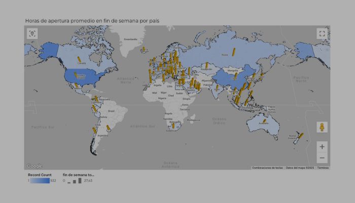
A combo map in Looker Studio is a layered Google Maps chart that combines a filled‑area map with a bubble […]
A combo map in Looker Studio is a layered Google Maps chart that combines a filled‑area map with a bubble […]
Modern charts in Looker Studio have arrived, and they’re more than just a design refresh. This update gives you advanced
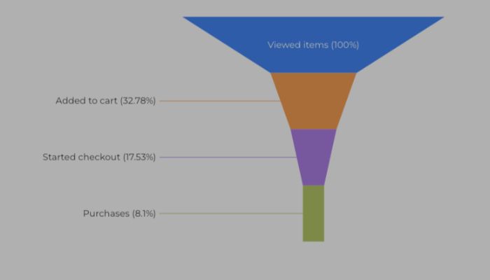
Funnel chart in Looker Studio provides a powerful visualisation to map user journeys and conversion drop‑offs in sequential stages, from

Waterfall charts in Looker Studio are excellent for understanding the sequential impact of positive and negative values relative to a

The Looker Studio treemap is one of the most visually engaging ways to explore your data. By displaying values as

The Looker Studio Sankey diagram is a powerful way to visualise flows between categories or dimensions. Unlike bar or pie

The Looker Studio scatter chart is perfect when you want to see how two metrics relate to each other. Instead

One of the most visually appealing ways to represent data in Looker Studio is through maps. In this post, we’ll

If you’ve been following my series on maps in Looker Studio, today we’re diving into another powerful visualisation: the Looker

Continuing with the posts on maps in Looker Studio, let’s look at another one offered by Google Maps: the filled